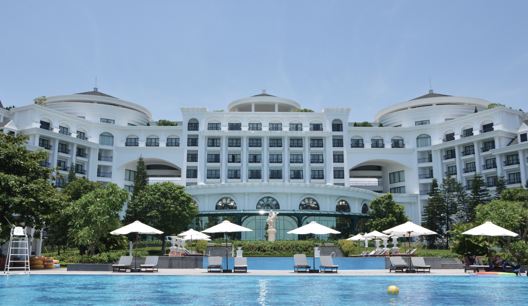
With the increasing demand for hospitality design in India, driven by factors such as the rise in interest in Lakshadweep holidays and spiritual travel following the inauguration of the Ram Mandir in Ayodhya, along with the government's efforts to boost domestic tourism, there's a surge in hospitality industry. Additionally, the successful organization of G20 meetings across 60 locations showcasing India's diversity globally contributes to this trend. A crucial design element, Paint, profoundly influences guests' experiences by shaping the grandeur of exteriors and the warmth of interiors, reflecting India's burgeoning tourism potential and the increasing demand for more hotels.
Let's explore how specific paint colours, design principles and application techniques can enhance the ambience and design of hotels or resorts, underscoring their legacy and impact.
Celebrating Heritage
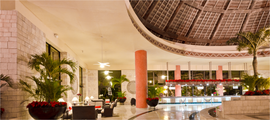
In the hospitality industry, incorporating sustainable painting alongside decorative painting in wall art and murals, adds depth and visual interest to walls and ceilings. From intricate murals depicting local scenery to abstract patterns inspired by cultural motifs, these artistic endeavours tell beautiful stories and immerse guests in a unique and memorable experience.
One such example is the Falaknuma Palace in Hyderabad which showcases a unique blend of architectural styles, incorporating elements from both the Art Deco and Art Nouveau movements, a rarity. Its opulent Mughal-styled gardens, adorned with influences from Rajasthani and Japanese designs, add to its grandeur. Within the palace, colours, and paint are utilized to enhance its regal ambience, with rich hues and intricate patterns reflecting the palace's historical significance and architectural splendour.
Colour Palette
In hospitality design, seasonal colour palettes can refresh entrance foyers throughout the year: warm tones for autumn, pastels for spring and summer, and cool hues for winter. Vibrant warm colours like reds, oranges, and yellows foster energy in lobbies, while cooler tones like blues and greens evoke tranquillity in bedrooms and spas. Neutrals provide versatile backdrops, complementing diverse décor styles, and strategic accent colours infuse vitality and character into public spaces.
Nature-inspired Colours
Nature-inspired palettes and sustainable, eco-friendly paints create a welcoming ambience in hotels. Deep forest green, warm terracotta and sandy beige hues seamlessly blend indoor spaces with nature, promoting the well-being of the guests and providing a comforting stay.
With eco-friendly paint options and natural colours for the interiors, the possibilities are limitless in hospitality design. Green environment paints with low VOCs (volatile organic compounds) can enhance the guest experience by creating an indoor environment free from pollutants, promoting health and well-being.
With the strategic use of colours and a wide range of textures for both exterior and interior paints, designers could craft immersive environments for customers. From the serene tranquillity of a spa retreat to the vibrant energy of a boutique hotel, the enduring legacy of colour and paints in hospitality design continues to shape the hospitality industry.
Keep following this space to access inspirational stories, insightful knowledge, and trends from the institutional paints industry.