“Design in black and white”, they say. “Add colour for emphasis when your design is complete.” You would agree if you were an Architect or a Designer yourself. Architecture, as an art form and a science, plays a crucial role in shaping the way we live, work, and interact with our surroundings. Beyond constructing buildings, architecture is about creating environments that shape cities & communities, influencing the overall quality of life and leaving a lasting impact on society. While Architecture is the hard shell, paints used, define its unique sense and sensibilities, extending beyond the mere aesthetics of form and function. Hence the quote, “…Add colour for emphasis when your design is complete.”
The Medium :
If Architecture is the energy, colour is its emotion. If the built space is an imagery, colour is its essence. The fascinating link between colours and human behaviour has been previously explored to conclude that, the use of colour can only add to the advantage of space & purpose comprehension. Colour can be useful in transmitting information non-verbally, establishing connections, and forming indispensable parts of memory. The colour aesthetics profoundly influence the educational experience, fostering belonging, pride, and heirloom. At IIT Bombay, department murals reflect academic and cultural values, depicting scientific concepts and heritage. NID Ahmedabad, JNU Delhi, and Srishti Bangalore use murals to spark dialogue, addressing socio-political issues and promoting artistic innovation. These vibrant visuals not only beautify but also embody the ethos of each institution, shaping a sense of identity and community. Additionally, concerns and knowledge about environmental issues are rising. Hence, selecting paints that not only provide aesthetics but also enhance the value of the space is of paramount importance.
The Method :
Colour brings alive the soul of the space and especially for educational institutions, where rooms become conducive to thinking, learning, participating, and walls become synonymous with authority, scale, and grandeur.
A few key considerations for campus colours:
Classroom: Blue helps improve mood, memory, and creativity among students, especially younger children. White is an excellent choice, when used in combination with yellow, it heightens alertness. Also, choosing eco-friendly wall paints for schools is a great initiative, as it contributes to a healthier environment and ensures the well-being of students and staff.
Libraries and Study Halls: Green spaces meant for studying and research help calm jumpy nerves and boost concentration.
Cafeteria: Using orange here helps boost young appetites and has the additional effect of making the young adults more social, allowing for better interaction with peers.
Administrative Spaces: While greys and whites are intimidating, adding deep purple or blue tones can evoke a sense of authority while keeping it social.
Public Spaces: One can transform lobbies and hallways by showing off official colours to give students and faculty a strong sense of school spirit and institutional branding. Choosing environmentally friendly paints for public spaces is a conscientious and enduring choice.
I TRY TO THINK AND DESIGN IN COLOUR – NELSON SHANKS

The Legacy :
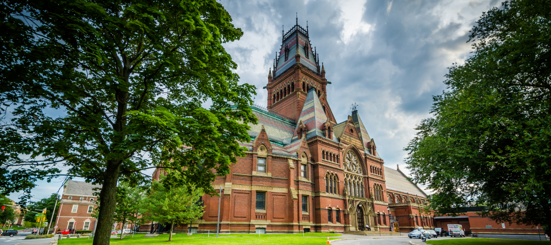
Iconic landmarks, historical buildings, and unique architectural styles define a city’s character and contribute to its sense of place. City’s educational institutions and schools are primordial grooming centres across generations. They invoke special memories, and form inseparable parts of time and period, elucidating strokes for a promising future. Whether it is the beiges, the browns, the reds from the bricks or the bright beautiful interior colours, they all need to stand the test of time to become a memorable legacy.
THE GREATEST LEGACY TO CREATE IS NEVER WHAT WE LEAVE BEHIND, BUT WHAT WE LEAVE WITHIN. SHARED MOMENTS, EXPERIENCES, STORIES AND MORE.

